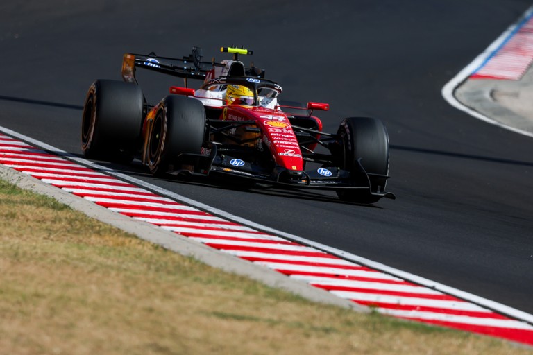
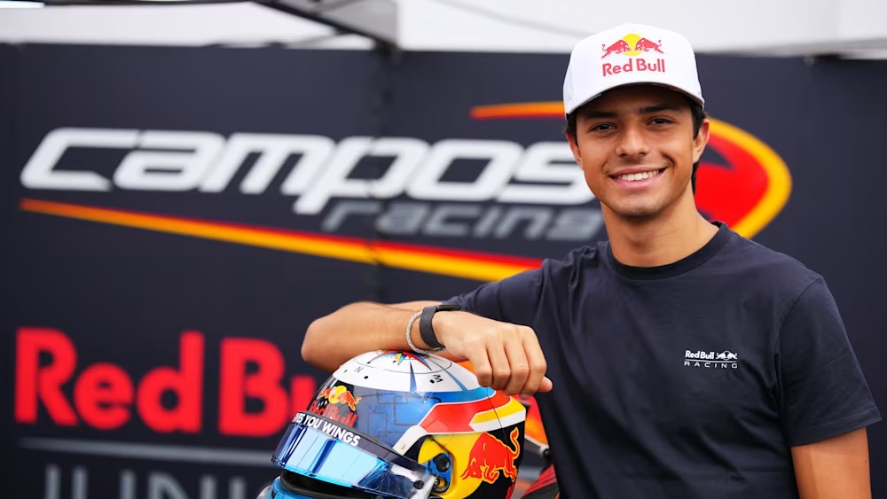
Pepe Martí enjoyed a standout F2 year on track and backed it up with flair thanks to his helmet. He showcased a vivid, eye-catching lid that tied his look together. The colours popped, the lines flowed, and the design drew eyes all weekend. He wore it with calm confidence inside the car, lap after lap. Its bold presence amplified his momentum and mirrored his form.
From first lid to now, the compass leads
Across the years, Martí kept his helmet concept steady and refined one core theme. His focus fell on the crown and the rear. At the top sat a compass emblem carried over from his first lid. His mother inspired the symbol during a search for something unique. From a rough sketch, he approved the artwork and sent it to paint. The result looked clean and purposeful. With each season, the motif felt more personal and enduring. On track, it tied his look together and echoed his calm intent. In the end, the helmet told his story without a word.
“To be honest, it’s remained quite similar across the years, I have always kept the same idea for the whole thing. One of the parts I love the most about my helmet are both the top and the back.”
“At the top I have the rose of the winds, which is something that has stayed with me since my very first helmet. It’s something that my mum brought up when we were thinking about something to put at the top, I wanted to make something singular, something I had not seen in other helmets.”
“My mum brought the idea up and I really liked it. We had a design made for it, and we just decided to go for it, to paint it and I have loved it ever since.”
Monochrome no more on the helmet —matte vibrancy for Martí’s second F2 chapter
In past seasons, he kept the helmet largely monochrome, with only small flashes of colour. This year, Martí broke from that script and embraced a full palette on his helmet for his second season in F2. The Red Bull branding and a matte finish set the tone and sharpened the look. Along the flanks, the bull motif took centre stage and nudged aside his old side mark—an S once filled with Spain’s crimson and fluorescent yellow. Those national shades still appeared, just softer and more restrained. The update felt fresher, brighter, and truer to his current chapter.
“It’s always been on the helmet but this year it has been a bit of change because it’s always been black and white. The only highlights were a bit of red or a bit of silver, but this year we decided to go with a very colourful option. I think it looks really cool, with the Red Bull colours and the matte, it’s quite cool.”
“With the Red Bull taking up the sides which is something I am very proud of, it’s shadowing the side a bit, which was just an S with the colours of Spain, so the blood red and the neon yellow. I still have the colours, it’s not as highlighted as it has been on different helmets, but it’s still really nice.”

Skyline and wind rose—home remembered, course set
At the back, he etched the Barcelona skyline as a quiet salute to home. Because the city shaped him, Martí carried it onto the helmet and kept his roots in view during the F2 season. Each return trip, in turn, confirmed the choice and kept the story close. Meanwhile, the compass rose on the crown endured and stood out more this season. With cleaner lines and softer contrasts, it breathed. As a result, city and symbol linked into a single thread. Ultimately, the design grounded him in where he came from and where he aimed to go.
“At the back, I have the skyline of Barcelona. It’s my city, it’s where I am from, it’s where I have grown up and for me it’s important to keep, stay with your roots, stay with where you’re from. I always love going back home and I think including it into my design was something I always wanted to do, so do it this year in this way is really cool. Same with the rose of the wind, it’s something I have always had on my helmets, but this one in particular it stands out pretty well.”
Colour and lines evolve, the tribute to Dilano remains
Above all, he reserved space on the helmet for Dilano. In every design, he carried his friend’s memory. Moreover, he treated that detail as non-negotiable, a quiet promise he kept. Each season, he found new, respectful ways to mark it. In turn, the tribute grounded the scheme with purpose. Ultimately, he honoured a close bond and let it ride with him, lap after lap.
“Always also a mention for Dilano, always keeping him in mind, he always takes up a space, he was a really good friend, and I am trying to honour him in anyways possible.”

Classic echoes, personal stamp—balanced against Red Bull colours
He stayed loyal to a familiar palette, yet recently leaned on more white for a cleaner look. Above all, he balanced every tone against Red Bull’s yellow and red, so the scheme felt cohesive. As a result, each accent worked within that frame. He considered green at one point, however, it clashed, so he dropped it. Instead, he aimed to add a touch more silver and white next year, while staying happy with the current setup. Many fans said it echoed Fernando Alonso’s classic colours, and he saw the link. Even so, he made it his own and kept refining it season after season.
“But I have always gone with this sort of colour scheme, but I have added in more white recently, I just feel like it looks quite clean. For me the things I take care of mostly are the colours. Red Bull have their own special colours of both the yellow and the red, and the other things have to match. It’s a juggle between what colours do I want that fit with the Red Bull scheme, and white fits well with any colour.”
“I wanted to add some sort of green at some point on the helmet, but I don’t think it would match the helmet. I want to add a bit more silver and white for next year, but I am very happy with my helmet.”
“It’s a colour scheme I really like. A lot of people tell me it reminds them of Fernando’s helmet. I can see how because of the colour scheme but I have made it my own, and grown around it, trying to improve it year in and year out.”